L2ART
Friday, 22 May 2015
Evaluation and Comparison.
Friday, 6 March 2015
Photography development
ANNIE
I then edited the vibrance and the saturation.
I then edited it with a warm tone.
EMMIE
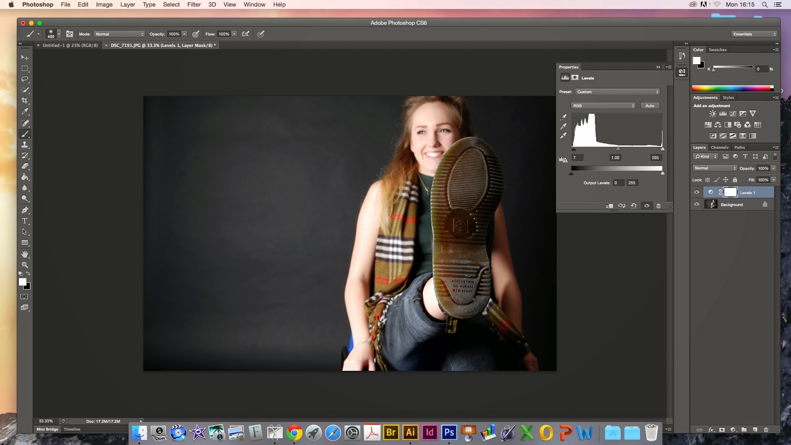
Again I edited the levels first of all
I then changed the brightness and the contrast.
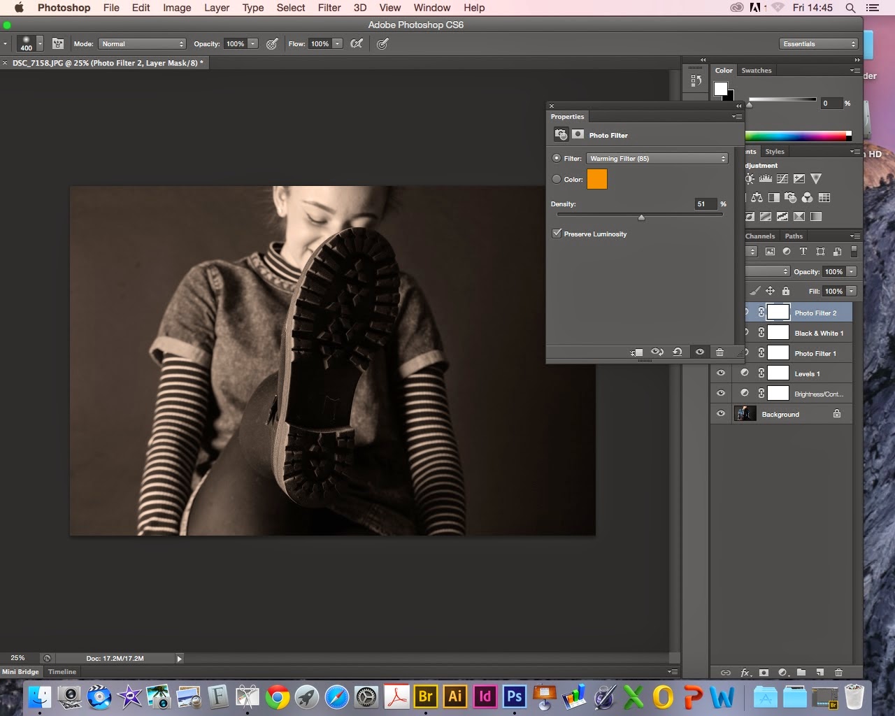
I then put a filter on it.
Then I changed the tone of the filter.
RANDOM GIRL
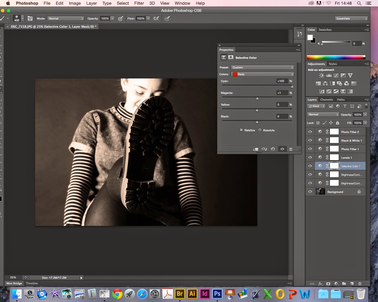
Again the levels went first.
I put this one in black and white to start with.
Then edited the brightness and contrast of it.
RANDOM GIRL 2
This image had already had the levels changed been put it in black and white and then the filter.
To finish it off i adjusted the brightness and the contrast.
So I screen shotted my editing as I went along changing the levels and firstly putting them in black and white to give the sepia a deeper tone then adjusting the vibrance, brightness and contrast of all of them to give them a really deep brown shade and making the photos look a lot warmer.
I'm going to do this with all of my photographs make them this warm and interesting tone, I've done my set up with peoples faces because I like the different expressions everyone has on their face as it is such an odd thing to ask someone to do.
The main focus should be the shoes but in a way I feel like everyones expressions take over from the shoe, you may see it first but peoples faces are much more captivating.
We were asked in this brief to capture the youth of today and I decided to use shoes but I feel like my work developed beyond that I feel like I also captured the people I used, I captured the actual youth of this age and I feel like it has worked out really well as I feel like I really did progress throughout this particular brief. I find it very successful and I think it worked beyond what I had expected it to be.
We were asked in this brief to capture the youth of today and I decided to use shoes but I feel like my work developed beyond that I feel like I also captured the people I used, I captured the actual youth of this age and I feel like it has worked out really well as I feel like I really did progress throughout this particular brief. I find it very successful and I think it worked beyond what I had expected it to be.
I'm linking my photography to an Italian photographer called Paolo Roversi.
He is a fashion photographer, who's work is incredibly interesting, his work is similar to mine in how he has edited a lot of his work in to looking aged and warm in the sepia type tones or he'll use black and white or if it is in colour they are very subtle calm tones. He subtracts away from the image like i did with changing the brightness and contrast to make it very raw.
I really like the tones he uses and the way he angles his images.
He always photographs people just like I have done in this project.
I really like the tones he uses and the way he angles his images.
He always photographs people just like I have done in this project.
This is a quote of his that I found very interesting and quite inspiring :
“My photography is more subtraction than addition. I always try to take off things. We all have a sort of mask of expression. You say goodbye, you smile, you are scared. I try to take all these masks away and little by little subtract until you have something pure left. A kind of abandon, a kind of absence. It looks like an absence, but in fact when there is this emptiness I think the interior beauty comes out. This is my technique.”
Here are a few examples of his work :
I also tried just leaving it in black and white and also photos just with a white background but I decided to stick with the sepia tones.
And use the images I took on the black background as my final pieces.
Here is an image I decided to try just in black and white.
This was one of the images on a white background but I dont like the way the tones take on the white background.
Monday, 2 February 2015
Graphics Typography
For my first graphics piece i decided to use spirals, using different fonts, different sizes, different opacity.
My first screen grab of the first spiral was very basic same font and normal sized writing.
I started to use different letter size and fonts.
Here I made the opacity darker so that the font would stand out even more.
Here I started overlapping my spirals and making words stand out more than others making them capitals.
In this screen grab all the letter sizes are varied and I've made even more overlapping the others.
Here I've just added more and more with all different opacities and sizes making it a very varied image.
In my final image you can see I have just layered and layered to give it the crazy effect with all the different opacities and sizes.
I'm very happy with how this worked out, it was a simple idea that developed in to something much more complex looking and more original. I used the same lyrics throughout and it turned out well when I highlighted some of the more meaningful words making them stand out more to the on looker.
My second Idea.
I really like how my final rose came out it looks very faint but I feel like it is quite a strong piece although I can not decide which one I prefer out of my two ideas.
I used the same song lyrics as before. I started off with a rose template and I wanted a very pretty and delicate writing so I chose the Lucinda Calligraphy Italic, and I chose red as I wanted it to be a classic red rose and as the song I chose was a love song I thought it would be a type of iconic image for the type of song that it is.
I decided to stay with the same font to make it look like a continuous pattern.
What I think could of made it better is a more simple version of a rose as where there were really small parts and odd angles it was hard to fit writing in and in some parts it didn't work at all.
I chose the black background just as a compliment to the red and I think it makes it stand out a lot more.
THE DIFFERENT FONTS
Here are a variety of different fonts that I chose from I couldn't put all of them as I used so many in my spiral piece and all different sizes and shapes but in my screen grabs you can see which fonts they were but in the rose I just used the Lucinda Calligraphy.
My link to an artist.
CRAIG WARD.
Is a British designer based in New York after finishing a foundation degree he worked his way through numerous advertising agencies.
He currently has his own studio called Words are pictures.
He mainly works solely in advertising.
He links to my work in these images in the first one because of the curves and different fonts and in different sizes and thickness and just the general difference in each sentence although they are not spirals they are still in odd curves and swirls.
In the second image he has used the words to create a shape such as I did with my rose he also used a bright red the same as I did.
Friday, 9 January 2015
Youth Culture Typography
Seven songs that have influenced me.
1.Tracy Chapman- Fast Car.
2. Blink 182 - After Midnight .
3.Kings of Leon - Use somebody.
4.Ed Sheeran- Nina.
5.Ed Sheeran - Photograph.
6.Birdy - Wings.
7.Goo Goo Dolls - Iris.
8.Vance Joy- Riptide.
My Final Song.
Goo Goo Dolls - Iris.
And I'd give up forever to touch you
'Cause I know that you feel me somehow
You're the closest to heaven that I'll ever be
And I don't wanna go home right now
And all I can taste is this moment
And all I can breathe is your life
When sooner or later it's over
I just don't wanna miss you tonight
And I don't want the world to see me
'Cause I don't think that they'd understand
When everything's made to be broken
I just want you to know who I am
And you can't fight the tears that ain't coming
Or the moment of truth in your lies
When everything feels like the movies
Yeah, you bleed just to know you're alive
And I don't want the world to see me
'Cause I don't think that they'd understand
When everything's made to be broken
I just want you to know who I am
And I don't want the world to see me
'Cause I don't think that they'd understand
When everything's made to be broken
I just want you to know who I am
And I don't want the world to see me
'Cause I don't think that they'd understand
When everything's made to be broken
I just want you to know who I am
I just want you to know who I am
I just want you to know who I am
I just want you to know who I am
Subscribe to:
Comments (Atom)


