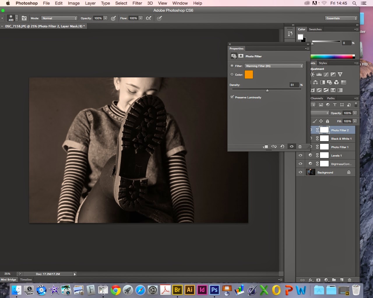
ANNIE
First of all I checked the level.
I then edited the vibrance and the saturation.
I then edited it with a warm tone.
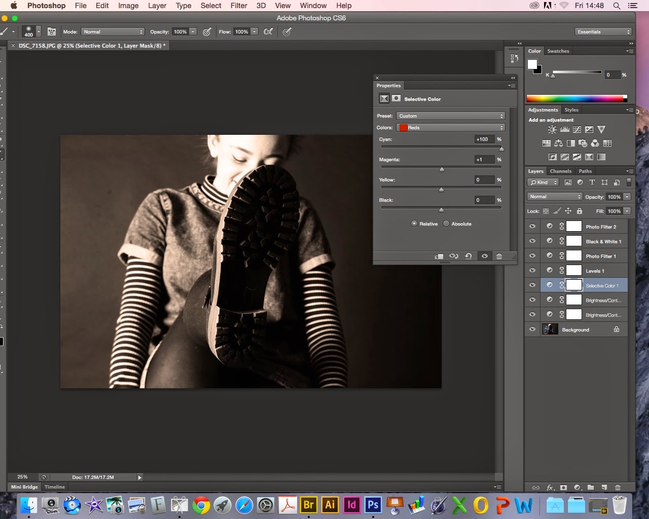
And adjusted the tone of it.
EMMIE
Again I edited the levels first of all
I then changed the brightness and the contrast.
I then put a filter on it.
Then I changed the tone of the filter.
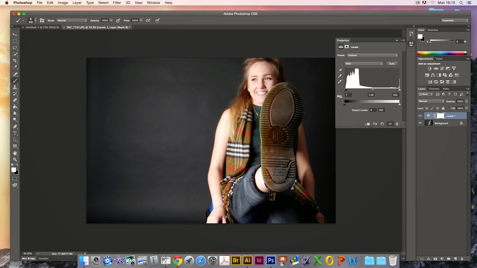
RANDOM GIRL
Again the levels went first.
I put this one in black and white to start with.
Then edited the brightness and contrast of it.
RANDOM GIRL 2
This image had already had the levels changed been put it in black and white and then the filter.
To finish it off i adjusted the brightness and the contrast.
So I screen shotted my editing as I went along changing the levels and firstly putting them in black and white to give the sepia a deeper tone then adjusting the vibrance, brightness and contrast of all of them to give them a really deep brown shade and making the photos look a lot warmer.
I'm going to do this with all of my photographs make them this warm and interesting tone, I've done my set up with peoples faces because I like the different expressions everyone has on their face as it is such an odd thing to ask someone to do.
The main focus should be the shoes but in a way I feel like everyones expressions take over from the shoe, you may see it first but peoples faces are much more captivating.
We were asked in this brief to capture the youth of today and I decided to use shoes but I feel like my work developed beyond that I feel like I also captured the people I used, I captured the actual youth of this age and I feel like it has worked out really well as I feel like I really did progress throughout this particular brief. I find it very successful and I think it worked beyond what I had expected it to be.
I'm linking my photography to an Italian photographer called Paolo Roversi.
He is a fashion photographer, who's work is incredibly interesting, his work is similar to mine in how he has edited a lot of his work in to looking aged and warm in the sepia type tones or he'll use black and white or if it is in colour they are very subtle calm tones. He subtracts away from the image like i did with changing the brightness and contrast to make it very raw.
I really like the tones he uses and the way he angles his images.
He always photographs people just like I have done in this project.
This is a quote of his that I found very interesting and quite inspiring :
“My photography is more subtraction than addition. I always try to take off things. We all have a sort of mask of expression. You say goodbye, you smile, you are scared. I try to take all these masks away and little by little subtract until you have something pure left. A kind of abandon, a kind of absence. It looks like an absence, but in fact when there is this emptiness I think the interior beauty comes out. This is my technique.”
Here are a few examples of his work :
I also tried just leaving it in black and white and also photos just with a white background but I decided to stick with the sepia tones.
And use the images I took on the black background as my final pieces.
Here is an image I decided to try just in black and white.
This was one of the images on a white background but I dont like the way the tones take on the white background.